Table of Contents
Running a successful ecommerce marketing campaign is no easy feat.
To get excellent returns out of your initiatives, you need to create compelling marketing materials and implement the best strategies, including following key tips for website design for your business.
However, this can be easier said than done since marketing involves many dynamic parts, and creating your marketing materials and website often requires graphic design skills and experience.
The good news is, we’re here to help you kickstart your efforts with these five graphic design tips to help you optimize your ecommerce marketing initiatives.
1. Know your brand
How your website and marketing materials look, including your overarching message, should best represent your brand.
To do this, you’ll need to establish who your brand is first, what your company is all about, and what makes your business unique from your competitors.

Start by asking yourself and your team these questions.
- What three words best describe your brand?
- If your brand was a person, what kind of person would it be? What is its personality, voice, etc.?
- What characteristics, features, and offers make your brand distinct from other ecommerce businesses?
- What does your brand do better than any other company in the industry or market?
Establish your brand identity and weave it into your ecommerce website and marketing designs.
This helps you raise brand awareness and recognition, build trust with your target market, and shape your strategies to increase customer satisfaction (among others) to ultimately drive sales.
2. Leverage minimalism
Effective designs don’t always mean filling your web pages and other marketing materials with texts, images, and other elements.
Plus, overcrowding your marketing materials with design elements can make it hard for your potential customers to see your offers clearly, defeating the purpose of your landing pages and other content.
You could waste a chunk of your marketing resources, and your prospects won’t be likely to act on your conversion goals, lowering your sales opportunities.
The solution? Adopt minimalist designs.
Using minimalist designs allows you to highlight crucial aspects of your marketing materials, whether it’s your calls-to-action (CTAs), special offers, product images, and other elements.
It also helps your brand give off a sophisticated, professional vibe, aiding in building trust with your potential customers and encouraging conversions.
Leverage some of the popular and easiest ecommerce platforms to use to design minimalist web pages.
For instance, Squarespace’s Hester website template features large images with solid background colors for all the web pages (such as the home, blog, and shop pages).

You can customize the template as you prefer and add a few other elements to make your pages eye-catching, helping draw visitors to your web pages and convert.
As cliché as “less is more sounds,” it’s still a highly effective approach when designing your website and marketing materials.
The less cluttered your marketing materials look, the easier it is for your potential customers to see the message you want to convey or elements you highlight. This increases your chances of converting your prospects and increasing your sales.
3. Keep your users in mind
Remember that you’re not just creating and designing your marketing materials for your brand.
To effectively connect with your audience and, in turn, reach your conversion goals, you’ll need to design your ads, promotional materials, and website (among others) with your target audience in mind.
For example, if you want to deliver excellent customer experiences on top of providing valuable marketing content, simplify navigating your website for your visitors.
Design your website to allow your audience to move through categories and pages easily and quickly. This helps you get your marketing content in front of your visitors with ease while delivering seamless shopping experiences.
Consider these factors when designing your website navigation and content to help bolster your marketing efforts.
- Determine the easiest website layout for your visitors to navigate. Ideally, it should only take two to three clicks for users to get from one web page to another.
- Organize your products (and product pages) logically, ensuring it makes the best sense for your visitors for convenient browsing.
- Make it quick and easy for your shoppers to buy your products by simplifying the checkout process.
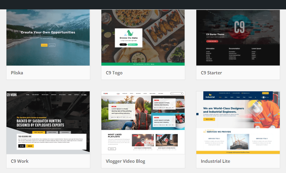
Opt for top-tier Content Management Software or Systems (CMS) such as WordPress.org. It offers themes and templates optimized for search engines, which means they’re designed with seamless site navigation in mind.

Put yourself in your website visitors’ shoes to help you anticipate what they want from your ecommerce website and incorporate the necessary design elements and features to meet those needs.
Doing so can improve the user experience, support your marketing efforts, and ultimately grow your sales.
4. Use intuitive design tools
You need high-quality visual content to run successful marketing campaigns.
After all, poorly-made and sloppy-looking images, videos, and other content are bound to turn off your potential customers, even causing them to question whether your company is the real deal.
However, creating top-quality visual content often requires graphic design skills and experience.
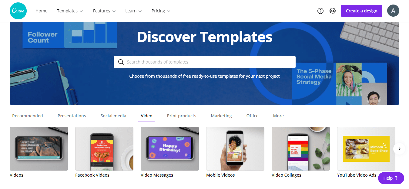
Easy-to-use graphic design platforms such as Canva provide a solution.
The platform has all the essential tools and features to help you create visual content for your marketing campaigns, social media posts, and other initiatives.
Canva offers a myriad of professionally designed templates to help you create stunning and compelling visual content in minutes, even if you don’t have tons of graphic design skills and experience.
For example, you can use Canva’s free video editor tool and customizable templates to make compelling marketing and social media videos in a jiffy.

Image source: canva.com.
You can add images, backgrounds, graphics, texts, colors, vectors, and your uploaded media. You can also include audio clips, apply filters, trim, and speed up your videos.
Create visual content easily with simple, intuitive graphic design tools. This streamlines producing and publishing your social media banners, infographics, and promotional videos.
5. Perform A/B testing
It’s not enough to design your website and marketing materials in a way that you think best represents your brand and works for your target audience.
You’ll also need to assess whether your efforts pay off and give your company your expected returns.
This is where split (or A/B) testing comes in handy.
A/B testing helps you assess the design, customer experience, or specific element that works best for your audience and drives conversions and sales.
Some of the vital design elements in your website and marketing materials include your paid ads, email newsletter headlines, subject lines, landing pages, the homepage, CTAs, etc.
Perform split tests of variations of your copy, layout, design, images, and videos (among others) to help you assess which ones get the best responses. This allows you to optimize your marketing efforts and ensure you don’t waste your resources while getting great returns.
Get better ecommerce marketing returns with graphic design
Planning, creating, and running your ecommerce marketing campaigns will take time and effort, but it’s not impossible to come out on top.
With a bit of creativity, finding the right strategies, and using the best-fitting tools, you’ll be on your way to implementing effective marketing efforts that drive your conversions and sales through the roof.
Add this guide’s graphic design tips to your arsenal to increase your chances of achieving ecommerce marketing success.

UI/UX Consultant, Photoshop, XD, SketchApp, Product Designer, Website Designer, Mobile App Designer, Expert WordPress Developer. For web/mobile design and wordpress development related projects please contact me at dibakar@themepurpose.com


