Table of Contents
Infographics offer an innovative and powerful way to share information with your audience.
By allowing readers to visualize the data at hand, they are adding to its effectiveness and creating a more valuable user experience in the process. With that said, it is important to understand that an infographic draws all its power from a solid design.
Putting together a well designed information graphic may seem like a daunting challenge, but not to fear. There is a method to the madness. The tips in this article will unleash the secrets to designing infographics that deliver everywhere it counts.
Collect the Data
The purpose of an infographic is to deliver information so gathering the data will be one of the most important steps of the process. Where to get that data? It may come from a variety of sources, including websites, PDFs, and spreadsheet documents. This part tends to be grueling, but it is necessary in order to connect the dots that will become your infographic in the end. No matter how tedious it gets, always put emphasis on presenting facts and accurate information. A single contradiction can ruin your entire presentation.
Tell a Story
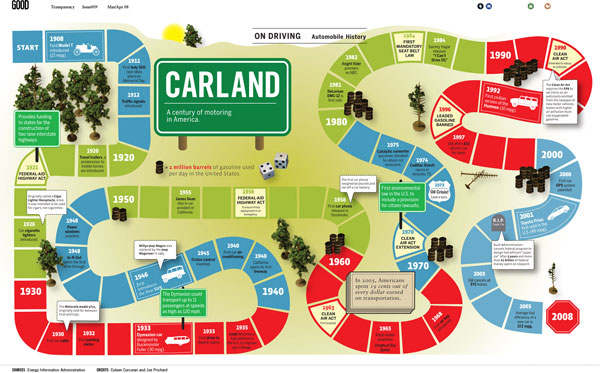
Great infographics not only provide valuable information, they tell a compelling story. Examples of this can be seen in some of the best infographics around the web.
The History and Evolution of Email (And Other Online Communication). This graphic traces the roots of email and online communication back to the 1970s. From then to now, it serves as an informational scrapbook that illustrates how far internet-based communications have come over the years.
What is an Infographic? Here the story is as straightforward possible — explaining exactly what an infographic is to the uninformed. This graphic goes on to provide a detailed definition, in addition to explaining what they are commonly used for, and what it takes to make a good one.
Are We Addicted to the Internet? The story of this infographic is the rapid global growth of the internet. Its moral can be found in facts and statistics on internet usage that translate to marketing opportunities for businesses.
Infographics obviously thrive on information, but without a story to back it up, you have nothing but a graph of well organized, boring data. Don’t think too complex with the storytelling component, though, because something as simple as creating awareness for a cause or bringing attention to a new trend in your industry could suffice. Its about how you present the story that matters.
Make it Scannable
In many cases, the goal of an infographic is to take complex chunks of data and break it down into simplified information. Realizing this, you should set your sights on a design that oozes scannability. So instead of pushing everything on the reader at a glance, you emphasis the key points they need to know most. Do this right, and the scanners will come back to check out the rest later.
Even though infographics are generally designed to quickly sum up information, it always pays to stay mindful that not everyone is going to have time to sit down and read one in its entirety on first glance. Don’t blow the opportunity to highlight your main points by trying to give it all away at once.
Incorporate Calls to Action
From the inbox to the landing page, calls to action are an integral part of effective marketing. They are a necessity when you think about it because without them, many people wouldn’t know what to do when interacting with a given piece of content. The power calls to action bring to marketing is the same power they can lend to well designed infographics.
When working with infographics, it’s best to keep your call to action as simple as possible. By this I mean limiting the number you use and putting them some place where they can be easily spotted. To prevent confusion, I recommend using a single call to action that you place at the very bottom of your infographic. This will make it easy for people who want to know more to go on to the next step.
Summary
The infographic thing is a pretty extensive concept. I could write several more articles on the topic of design alone, but this show is just about over. While I couldn’t cover everything, I like to think I touched on some points you don’t often see covered on the typical tips list.
What infographic design aspects do you feel need to be highlighted? Let us know in a comment.


