Table of Contents
Bus shelters, taxis, elevator walls, beer glasses, websites, Instagram, and Facebook, ads are everywhere. The average American sees or hears more than 5000 marketing messages every day.
How can you create online ads that attract your target audience and hook them in for good?

We have all seen Coca-Cola, Nike, Apple, and Facebook create a brand identity that is hard to forget. While these brands grabbed our attention successfully, many others left us wondering what the advertiser was trying to accomplish.
You see, great ads are more than just visuals or words; they tell a story, create an experience, and leave you wanting more.
If that’s your goal, then it’s time to invest in video content that evokes emotions in consumers and helps you foster a genuine connection with them. A consistent branding style and tone will establish your product and make it distinguishable in the industry.
We have compiled a short guide to making ads that stand out and are more clickable, using a few marketing tools. Let’s begin:
Create A Visual Style Guide
Building your brand’s style guide is vital before creating and publishing any content online.
A guide establishes specific rules regarding the content for writers and designers both. This ensures a consistent style throughout the design and copy while also helping your ads reflect your brand’s identity and goals.
Here’s how else it helps:
Stay Consistent
Having a visual style guide makes it easier for writers and designers alike to create content with little to no confusion. A manual can also help establish visual elements that should be consistent with each post like the color scheme used, a tagline (if there is any), or the tone.
For example, the watch company “Horse Brand” markets all their watches in a simple way. Their social media marketing strategy involves capturing different people going about their day’s work, always wearing the same watch.
This type of consistent branding tells people that wearing a watch is as easy as doing your favorite job. It also keeps customers coming back to the brand’s page to look out for new posts that day.
Have A Visual Theme That Fits Your Audience And Mission Statement
A key benefit of having a visual style guide for your company is to build your brand’s statement. Without a useful guide or an aim to follow, your team may likely develop a mixed bag of content, all with their own interpretation.
A guide book provides direction and clarity for your content team to make all marketing decisions and establishes the mission statement that it is trying to create for its customers.
California inspired brand, Urban Outfitters’ uses a consistent funky style of photography, colors, and typography that makes its posts unique and distinguishable. The company also doesn’t shy away from using graphics that highlight its ideal consumer: youth’s quirky lifestyle!
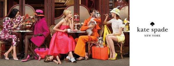
Similarly, Kate Spade stands out as a luxurious handbag brand because of its effort to develop an authentic persona for its audience. The Kate Spade girl is independent, wild and witty, and this is depicted using Spade’s line of colorful and luxurious high-end handbags.
Keep Your Content Simple and Authentic
When creating picture advertisements, brands can either flaunt their products or connect with their consumers with a simple yet powerful message.
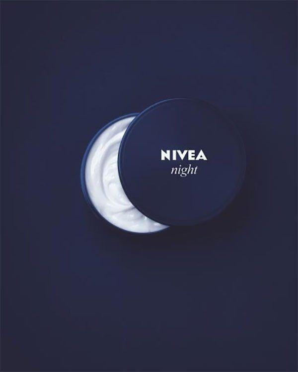
This ad by Nivea Cream is simple and relies on one image and idea to convey what its product stands for. Even before reading the tagline or watching an advertisement, the consumer instantly understands that the product is a night cream depicted by the crescent shape, capturing the imagination in its simplest forms.
A simple yet highly visual ad gives a greater chance of appealing to more people and can be a one-way ticket to an effective marketing strategy!
To give your brand a unique view-point, you have to be visually different. One way to do that is to develop a unique brand voice and personality that resonates with your products. Your choice of visuals and language can help convey your brand voice – and sometimes, that’s all you need.
Make Animated Online Ads
Making video advertisements are a great way to market your product. Research shows that 79% of consumers prefer learning about a product through video advertisements and 84% of people are likely to be convinced for a product after watching a video.
And when it comes to videos, animations tend to do even better.
Animated advertisements require less input production-wise and show your brand’s uniqueness and creativity with only a few tools. In fact, one study shows that creative shampoo and detergent ads can increase sales by 4% using this strategy.
If you want your product to captivate your audience, stand out amongst your competitors, and not cost you an arm and a leg, making an animated advertisement is a way to go. These videos are easy to grasp and resonate with every type of audience. Be it a child or an adult; everyone appreciates a short animated advertisement trying to tell them a story.
It’s always good to use brief story-telling techniques that always end with a solution; the audience will flock to you to learn more and give your animations the attention they deserve.
In 2018, UK’s major biscuit brand, McVitie’s launched a 60-second 3D animated advertisement for their campaign titled #SweeterTogether. The short advert tugged at millions of hearts as it showed how a sad crane operator connects with his co-workers through a cup of tea and some McVitie’s biscuits.
The ad depicts McVitie’s as a brand that can bring people together with the smallest gestures, like sharing biscuits and tea. The campaign runs widely, both digitally and on television, with 70% of customers agreeing that it had them hooked.
If you can manage to make such a heartfelt advertisement, the internet will only make it better. Luckily, such engaging and animated commercials are shared on social media, making them highly accessible to people.
Unfortunately, hiring animation studios or professional video-making teams can put a strain on your budget. Instead, there are various free options online that let you make quality animated videos right in your browser.
These videos can look and feel precisely how you want them to, without having to bother or wait for a production team. Imagine engaging a broad audience using your creativity, design skills and video marketing tools from PosterMyWall.
Appeal With Emotion
Due to the massive amount of information available online, consumers face information overload and confusion. They are looking for brands that understand the prevalent social issues and foster connections between people.
For example, in a recent study, 51% of consumers say that their relationship with a brand is based on how well it understands their desire. That explains why businesses are competing hard with one another to create attention-grabbing content.
However, what they don’t realize is that the nature of their target audience is changing. Consumers no longer want to see exaggerated colorful content on their screens and devices. They are looking for brands that understand popular events and social issues that they could relate to – so the “way” you attract audiences should also change.
When creating content, the message you’re trying to convey should conjure up strong emotions in your audience to leave a long-lasting impact on them.
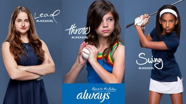
Always was quick to realize the impact of gender stereotypes on women and what it could mean for a girl’s self-esteem and confidence. These stereotypes associate traits like leadership, power, and strength with being a man and traits like sensitivity and fragility with being “like a girl”.
With their 2014 #LikeAGirl campaign, Always managed to highlight a social issue and sparked a connection with women worldwide. The campaign even managed to win Digital and Advertising Pencils (awards) across 8 separate categories, including “film advertising” and “creativity for good”.
When it comes to your brand, your ability to tell a story and persuade your audience can make all the difference.
Show, Don’t Tell
Creating content that speaks to your audience is the core of advertising. However, there are times that people may not have the time to view ads, no matter how emotional or interactive they are.
How else can I hook customers in then?
We are glad you asked.
It’s simple! Use the power of visuals to create an enriching experience that is hard for your customers to forget.
Rolex is one brand that uses powerful visuals to highlight its brand sentiment of being a classic. Using a warm color palette like shades of browns and pinks, Rolex treats its content like it would treat its customers – with an appreciation for high-end quality.
Similarly, Curtis Tea creatively advertises its various tea flavors by rendering different flavors into a teapot’s shape. Instead of watching a full advertisement or reading a post on the different flavors available, viewers can just glance at one simple visual and guess the tea’s flavor.

As Curtis Tea employs, powerful visuals show customers your brand’s creative, bright side making them want to engage with your product.
Remember, there are probably several other brands that are all marketing the same type of product. Your advertisement should highlight the unique features of your product and why consumers should consider your product over all others. Online video making tools from PosterMyWall offer customizable templates, interactive graphics and other resources to help you make visually attractive videos.
Make your audience visualize themselves using YOUR product and getting those benefits.
Key Takeaway
Story-telling is a powerful tool, and by using compelling narratives, your product or service can positively impact your audience. And if your advert can relate to social issues and connect with people, all the better!

UI/UX Consultant, Photoshop, XD, SketchApp, Product Designer, Website Designer, Mobile App Designer, Expert WordPress Developer. For web/mobile design and wordpress development related projects please contact me at dibakar@themepurpose.com


