Table of Contents
In order to build up your brand, you need to go the extra mile in offering your users something that differs from the same old website information and services.
To keep them engaged and to build trust and interest in your brand, you should continually develop creative, interactive web campaigns. These can come in the form of microsites, which are single-page sites that provide users with certain information that they gain through actively engaging with the site.
Interactive microsites are most often full of design and coding creativity that isn’t typically seen as much on full websites, because there is more room to provide a fun experience with their simplified and focused content. This collection of successful interactive web campaigns is meant to provide you with inspiration as you begin to plan your own web campaigns to impress and engage your users.
Here you go
Meet the Pros 2014
Promoting an event is a perfect reason to create a focused microsite. This site is successful because besides offering all relevant information, the single call-to-action to register for the event cuts out any distraction from its main focus. In addition, each scroll section has different graphic effects and visual interactions, which keeps the experience interesting.
Simply Business Twitter Guide
Cash Flow Guide
These sites have a shared purpose of walking users through a step-by-step process to reach an end goal. Users are able to begin the guides at the beginning, or skip ahead to the steps that apply to them and their current knowledge. They can then click to get information that will help them at their present stage, which promotes continuous interaction until they reach their goal.
The Space In Between
This site navigates through all its sections with a smooth parallax scrolling effect that informs users while they enjoy changing backgrounds and well-designed interaction between copy and imagery. An added convenience is the navigation menu can either be clicked to view sections, or just referred to in order to see which category is currently being viewed.
Name that Uniform Quiz
Minimal Music Quiz
Another effective way to bring out user interaction is through fun quizzes. By allowing visitors to input their answers to your questions, they invest interest in finding out how much they know. These sites even enable users to challenge their friends to beat their scores through different social media sites, which is a great way to gain exposure and a growing following for your brand.
Biking Boss
This simple campaign generates user interest by showing the personality of the brand and the progress the campaign is making. The page explains the purpose of the site and makes user action incredibly simple. With subtle movements in the background and an entertaining goal, users easily become interested in its development and will likely return to see how it’s faring.
L’unitá
As users scroll through the different sections of this restaurant’s microsite, they are provided with quality photos and relevant information about the brand. At regular intervals, they are given the opportunity to click to different sections to learn more, make reservations or contact the company. Whether they click on each link or simply scroll through the entire site, they are staying engaged and taking action to see more.
Pixel Fable
This site has a beautiful design and simple navigation, by which users can access the stories they want to read, learn more about the brand and share the page with friends through social sharing. The minimal content and simple navigation encourages user action and choice in what they want to see.
MyOwnCorks
On a single page, this brand gives background information about its purpose and directs users to its call-to-action. Through simple graphics and copy, it also gives other options for users to act on.
Pixel Lab
Complete with subtle animations of its illustrations, this site allows users toscroll through the different categories. The bold color scheme and flat design are perfect for a microsite, as a full site would be overwhelming.
Bioipsum
This biography-generating campaign makes for a fun and easy game for users. Minimalistic icons and layout and clear calls-to-action make for an entertaining experience that encourages users to keep interacting with it.
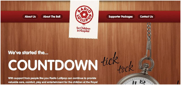
Radio Lollipop
This page is rallying support for its organization by connecting with audience’s empathetic side through a design that reflects its purpose. By giving relevant information and providing ways to get involved, users feel as though they are well informed and that their action matters.
Defend the Internet
This microsite shows how an interactive web campaign can be instrumental in promoting social or political action. This page provides an easy way for users to take action for the cause through strategically placed calls to action.
Whatever purpose your interactive campaign will serve, the possibilities for making it happen are virtually endless. Use these successes as inspiration and remember to keep yours focused, simple, creative and user-centric.


