Table of Contents
Web hosts are what makes the Internet possible. They store or “host” websites on supercomputers called servers. When an Internet user types a website domain into their browser, their device will connect to the host server, allowing them to view the website on their screen.

The conclusion is inevitable: as one of the cornerstones of the world wide web, hosting is a very profitable business. The industry’s global market share had a $32.12 billion valuation in 2017. What’s more, that number is expected to reach a staggering $76.2 billion by 2023.
Unsurprisingly, that makes the web hosting market highly competitive. As of May 2019, there were 338,561 web hosting service providers worldwide — and counting. Therefore, to make it in the industry, it is important to outshine the competition.
What’s more, you would need to woo prospective clients, and when it comes to that, looks matter.
Can’t Make a First Impression Twice
For better or worse, our brains are hard-wired to make decisions based on first impressions: studies show that it takes as little as 0.05 seconds for visitors to form an opinion on the visual appeal of your website.
And if potential clients don’t like what they are seeing, it would be hard to convince them that you can help them build and support a website that would generate and convert leads.
But what is it that makes a website’s design attractive? The secret to success is twofold: simplicity and familiarity. Visitors show a clear preference for low visual complexity as well as websites that are typical representatives of their category. In other words, your hosting website should be simple and streamlined and should look like, well, a hosting website.
However, you don’t want your site to look just like any other hosting website out there. To make an impression on visitors, you have to stand out from the crowd — which is why unique branding is essential.
Confused? Something tells us you could use a few high-quality examples.
Here are the 10 best web hosting website designs in 2020:
AbeloHost
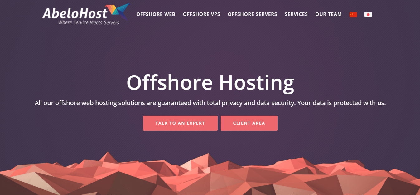
AbeloHost is one of the world’s leading offshore hosting providers, and its website certainly has a design to match. Its homepage couldn’t be any simpler and more intuitive. It opens with two prominent center buttons — one for prospective and one for current clients — that take you to the relevant section of the website.
To learn more about offshore hosting and AbeloHost at a glance, you simply have to scroll down. Its service packages are cleverly represented by icons inspired by plants and nature — a clear reference to how AbeloHost can help your business grow and thrive.
Hostinger
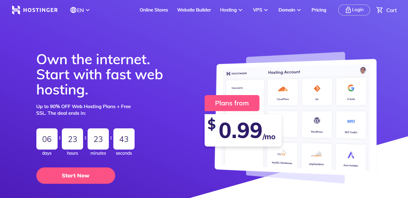
Hostinger offers web hosting and website building solutions and also specializes in servicing eCommerce stores. Aside from Hostinger, there are other hosting providers that offer building solutions, for instance, Bluehost is one of the best website builders for WordPress.
Its homepage gets down to business from the start. It opens with Hostinger’s latest offer, a countdown clock, and a bold pink “Cart the deal” button. This is what intuitive website design is all about: making conversions. You want the visitors landing on that page to buy your services, so why not get right into it and guide them to close the sale?
What’s more, the various features and services throughout the website are paired with real-life visual examples. The slick and clutter-free layout balances strategic pops of color with plenty of white space to further maximize readability and allow for easy, intuitive navigation.
ViceTemple
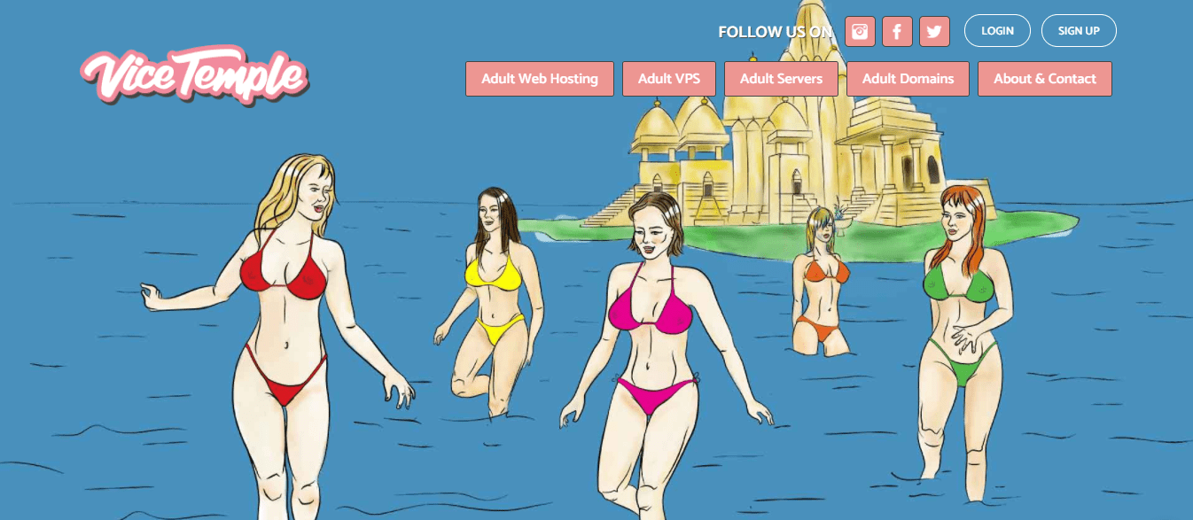
ViceTemple was established fairly recently in 2016 but has quickly become quite the gamechanger in the adult industry. From hosting to themes and scripts, it offers a one-stop solution for all kinds of adult websites at competitive rates.
What’s truly remarkable about ViceTemple’s website design is its thematic consistency. Every single picture and icon, as well as the names of all subscription types, are sex-themed. From “Stallion” and “Mattress Actress” to “Unholy Afterlife” and “Princess of Sin,” ViceTemple does not leave much to the imagination.
And yet, for all the sexual references, the overall impression of the website is rather playful and lighthearted — thanks to the Andy Warhol-esque comic art and the candy-pink and baby-blue color scheme reminiscent of a 50s diner. ViceTemple certainly has its brand aesthetic down to a T.
Hostens
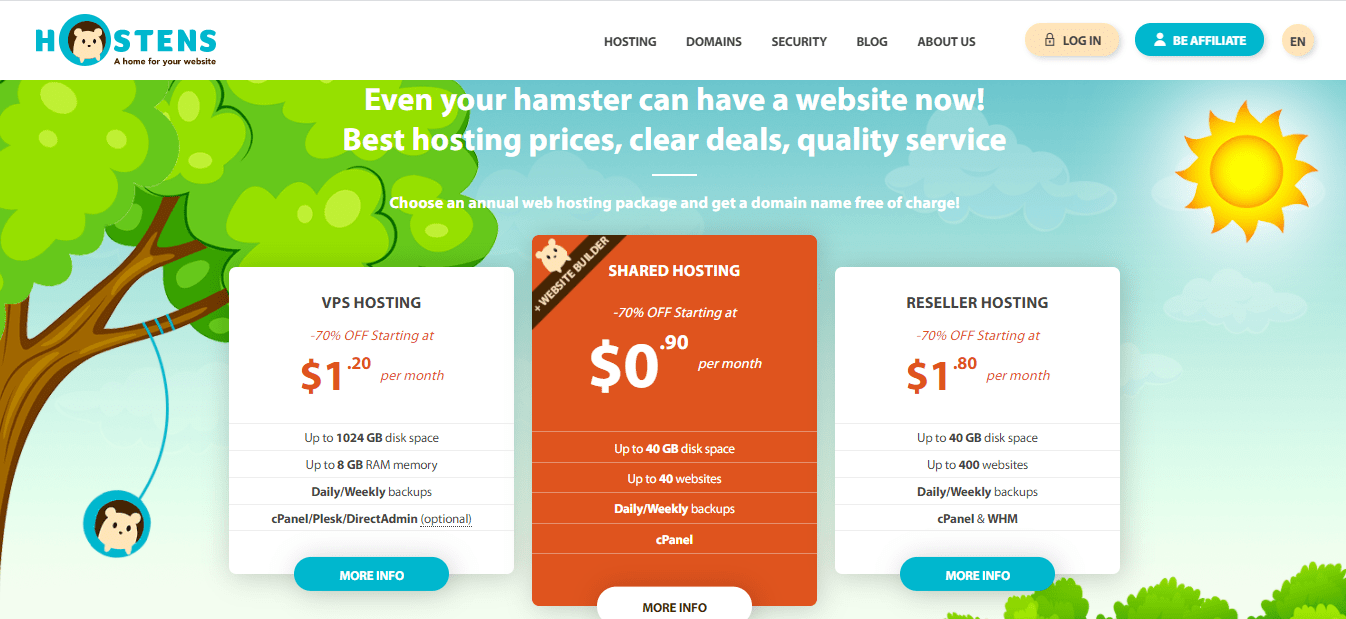
The Hostens website is not one for wasting the visitor’s time. The homepage jumps right into the annual hosting plans and lists their key features. Further down, you get a domain search finder and bite-sized information bubbles on Hostens’ features.
The rest of the website is extremely easy to navigate, too — and the Hostens hamster mascot is everywhere. (Yes, they have an actual hamster on their team.) That, along with the colorful, children-book-inspired graphics, helps make visitors feel at ease and as if among friends.
Heficed
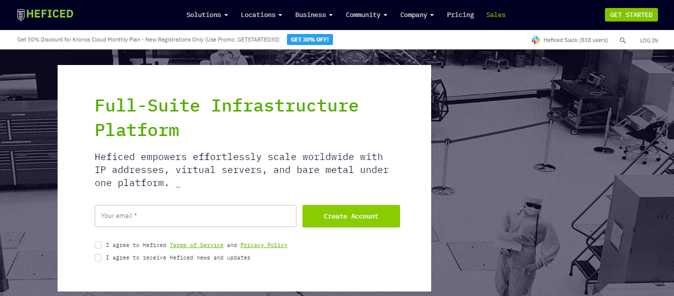
With its circuit-board black-and-green color scheme, Courier typeface, and flashing underscore cursors, Heficed’s website strikes an unmistakably geeky pose. The second visitors open the website, they think of computers and IT guys. And what better association for a web hosting service provider?
ARZHost
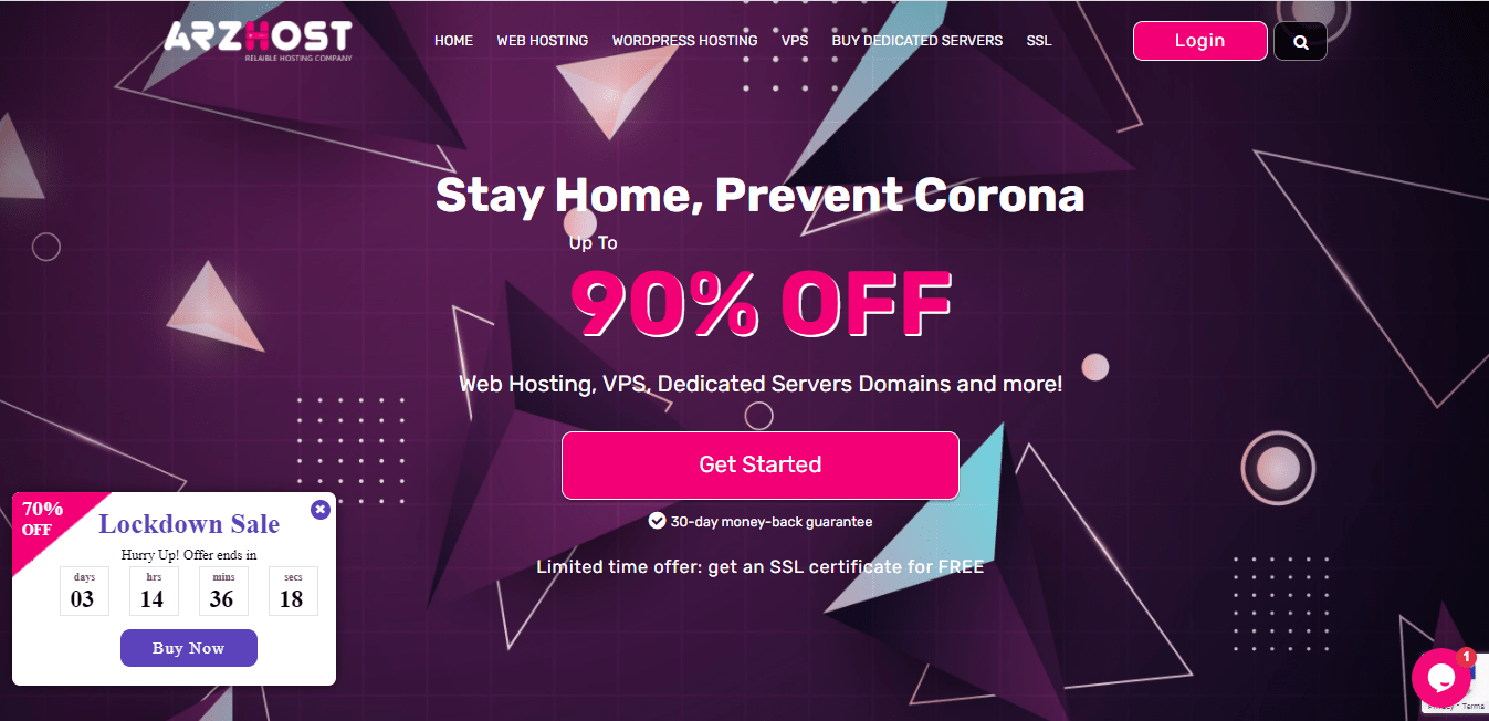
The ARZHost website sells hard. The homepage opens with their latest limited time offer. Then come a domain finder with a price breakdown, their hosting plans, and all the reasons why ARZHost is a great choice for reliable web hosting. Oh, and there is a pop-up window with a countdown timer that always stays on your screen as you scroll up or down.
ARZHost’s unique branding fits in perfectly with this aggressive marketing style. From the bold color scheme to the edgy triangles, everything about their website is bold, confident, and unapologetic.
Krystal
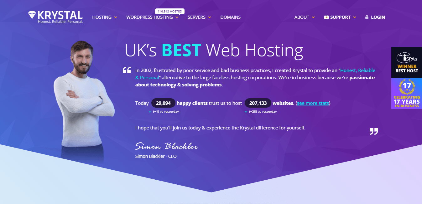
Krystal’s branding is all about building a personal connection with their clients as an alternative to the large and faceless corporations that dominate the market, and their website certainly delivers on that front. The homepage opens with a message signed by Krystal’s founder and CEO, Simon Blackler — and you can see his photo, too.
Krystal is also an environmentally-conscious company, which is why a substantial section of their homepage provides information on their use of clean energy and involvement in green projects. The various industry awards that Krystal has won, as well as stats about their customer support, take up the rest of the space.
Overall, the website gives off the impression of a friendly, small-scale service provider with a stellar track record — which is exactly how Krystal seeks to market itself.
Krystal’s visuals and consistent branding are also worth mentioning. In keeping with the company name, the website background features crystalline shapes, and their subscription plans are called “Amethyst,” “Ruby,” and “Sapphire.”
LYF Solutions
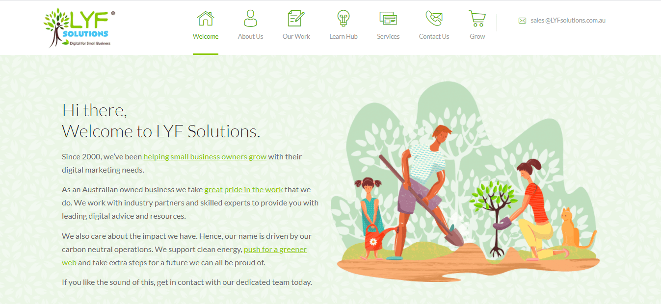
LYF Solutions is another green service provider. It specializes in helping small businesses with their digital marketing needs, from hosting and web design to content marketing and SEO. Its website design is certainly reflective of that. It features pictures of people planting and watering trees, a pervasive leaf motif, detailed customer testimonials, and a lot of information about LYF’s green values.
The push toward sustainability and clean energy has been a major industry trend in the past few years, and LYF is one more proof that the trend is here to stay. That’s something both new and existing market players will need to consider if they want to stay competitive.
Ikoula

Ikoula have been around for a long time (since 1998, to be precise). Since then, they have revamped their website more than once, and each time they refused to give up their signature orange fish emblem. And they really were onto something there: the fish is unique and memorable. The question was how to make it fit in with the overall branding.
This time around, though, Ikoula have outdone themselves. They seem to have finally found a way to weave in the fish symbol seamlessly and consistently throughout the website. And the eye-catching orange-and-blue color scheme is worth a mention too.
SiteGround
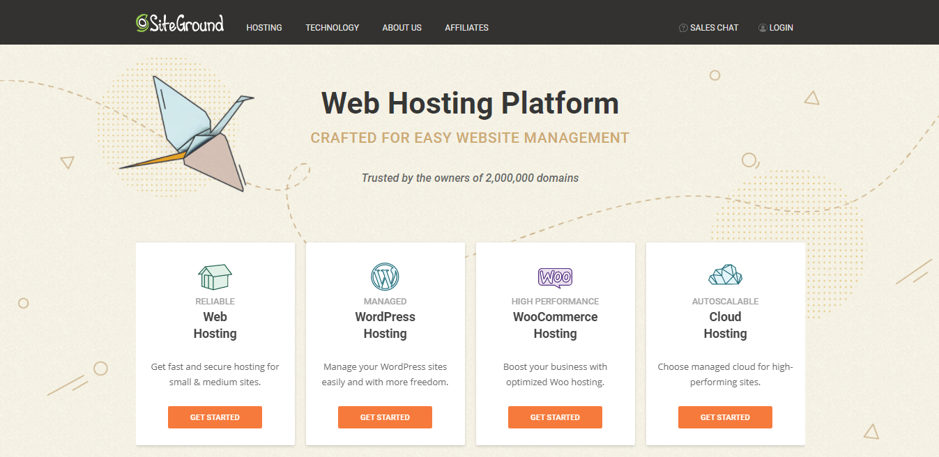
Last but not least, we have SiteGround. Everything about the website — from the motto “Crafted for easy website management” and the paper-like background to the pictures of origami cranes, boats, and planes that seem almost hand-drawn — suggests an artisanal and personal approach with great attention to detail.
The design also makes generous use of white space and does not overwhelm the visitor with heavy chunks of text. That’s a great choice considering website visitors’ preference for simpler visuals.
The Best Hosting Website Designs: Final Thoughts
A premium hosting provider will have a visually-impactful and professional-looking website. The hallmarks of high-quality web design include simplicity, ease of navigation, a well-thought-out color palette, intuitive layout, and unique branding.
That said, however, there are other — and more important — factors to consider when choosing your web hosting service provider. These include the type and quality of the services offered, the provider’s track record, and, of course, the price points.

UI/UX Consultant, Photoshop, XD, SketchApp, Product Designer, Website Designer, Mobile App Designer, Expert WordPress Developer. For web/mobile design and wordpress development related projects please contact me at dibakar@themepurpose.com


