Table of Contents
When it comes to designing a website or an application, the smallest things matter. The design provides the biggest difference to user experience.
The layout, the content and the colors have a huge impact on users and their opinions about the site. One needs to consider the best approach to making the best impression on prospects.
Web design involves not only the development of an aesthetically pleasing website but to blend different design elements to affect the visitors in a certain way. This is where the psychology of web design comes into play.
Here are some of the areas of website design that can redefine the psychology of users and help you in creating effective websites that never fail to engage users, or spark the right emotions.

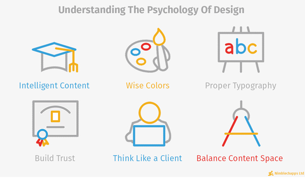
Design your content intelligently!
Your content is pivotal to users and one of the primary reasons for visiting it. Presenting content in a user-friendly format is crucial. The content should be easily consumable and accessible and no section should be verbose that is bound to leave users irritated and frustrated.
The content needs to be edited and structured so that you can provide the right information to your prospects. An easy, logical read of the content will entice users to trust you more and help them buy your products, or get going with an action that you need on the site.
Use color wisely to make an impact
The colors used in web designs are aligned to organizational branding but one needs to use colors based on their famous connotations and then use it. For example blue implies trust and reliability while colors like orange and yellow can really welcome users for making a connection. Red stands for fiery and passionate attitude while blue is calming or corporate. Cooler hues are known to be relaxed and professional but warmer tones can actually hint at creativity in some measure.
Consider using the meanings of different colors to enhance the usability of your website. Visitors engage with the site and first respond to the colors used on the site. It’s essential to have colors that can drive your message.
Typography used with maximum impact
There are thousands of different typefaces available but not all typefaces convey the same thing. They inherently convey different messages and even affect the visitors in a certain way.
Serif fonts including Times New Roman are known to be more professional than the other fonts like Verdana, though it is perceived to be one of the finest modern and informal fonts. Sans serifs like Helvetica are modern too but like Verdana, can invoke an informal feel.
If you want to convey a message, using an appropriate font is crucial so that the message is communicated without any problem to the users. As with color, the typeface triggers a complex set of emotions and hence needs to be used wisely. Choosing an optimal font size also helps in giving the rest of the elements some room to breathe.
Build trust with your visitors
Before influencing website’s visitors, one needs to establish trust by making your purpose clear throughout the site. A designer’s site should consist of intelligent designs while a writer needs to have a portfolio of the same on the site. There should be some familiar design elements so that the users are not alienated right on the loading of the site home page. Also, you can create templates from huge libraries or hire a custom website development company who also provide visitors with a familiar and easily navigable site.
Think like a client and act on their preferences
A navigation bar should tell visitors about the information they need.
A website that stuffs information, or pushes too many images, drives cognitive load thus driving the visitors away, paving way for drop-outs.
Visitors are curious about the site, the services and your brand identity.
Adding taglines or categories will help on the navigation front.
Be clear and precise about the services, skills and experience and back the information with appropriate dates and names. Visitors would love to view sites when on the move so it is important to have a responsive site that can render appropriately on different platforms and devices.
Give your content space
To avoid overwhelming viewers with a load of data, create a visual or an infographic that can convey the same verbose information with the help of images, statistics and cartoons. The visuals help the users to consume information quickly and hence stand out by making good use of negative space.
A minimalist approach helps too in setting out every element of the site with the right amount of importance and even balances the site with text and graphics. Too many colors will ruin the impact of the site; hence one should stick to 2-3 colors only when designing a minimalist site.


