A thumbnail has one job: to be understood in less than a second, at the size of a fingernail, next to a dozen other thumbnails competing for the same glance. Designing YouTube Thumbnails effectively is not just about making them look attractive; it’s about making them easy to read at smaller sizes. Most thumbnails that underperform are not ugly. They are simply hard to read at that size. This guide walks through the three design decisions that matter most — layout, contrast and text size — and gives you a quick checklist to run before you upload.
Start with the size people actually see
YouTube asks for a 1280×720 image, and that is what you design on. But very few people ever see it that large. On a phone home feed the thumbnail is roughly 360 pixels wide; in the “Up next” column on desktop it can be as small as 168×94. Design for the big canvas, judge it at the small one.
A simple habit fixes most problems: export your draft, shrink it to 168 pixels wide and look at it on your phone at arm’s length. If you can’t tell what the video is about in one second, neither can a viewer scrolling past.
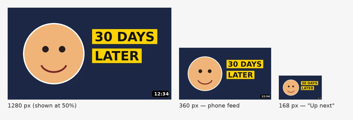
the same thumbnail at 1280, 360 and 168 pixels wide, side by side
Layout: one subject, one idea
The strongest thumbnails have a single focal point. A face, a product or a result — not all three.
Use the rule of thirds, but leave the bottom-right corner empty. YouTube places the video length badge there, and on mobile it can also be covered by a progress bar. Anything important in that corner gets hidden.
Make the subject big. A face that fills a third of the frame reads at small sizes; a full-body shot in the middle of a room does not. Crop tighter than feels comfortable.
Keep the background quiet. Blur it, darken it or replace it with a flat colour. A busy background competes with the subject and turns into visual noise when the image shrinks.
Point the eye. An arrow, a gaze direction or a circled detail tells the viewer where to look. Use one, not three.
Contrast: separate the subject from everything else
Contrast is what makes a thumbnail readable before the viewer has consciously looked at it.
Light against dark, warm against cool. A subject in warm tones (skin, orange, yellow) on a cool or dark background stands out immediately. The opposite works too, as long as the two are clearly different.
Add an outline or a soft glow around the subject. A 6–10 px white or light stroke around a cut-out person separates them from the background at any size. Keep it subtle at full size — at 168 pixels it will look just right.
Watch YouTube’s own colours. The interface is white or near-black depending on the viewer’s theme, and red is used for the subscribe button and progress bar. A thumbnail with a white background disappears in light mode; a mostly red thumbnail blends into the page. Check your design against both themes.
Test in greyscale. Desaturate the thumbnail. If the subject and the text are still clearly separated from the background, the contrast is working. If everything turns into the same mid-grey, it isn’t.
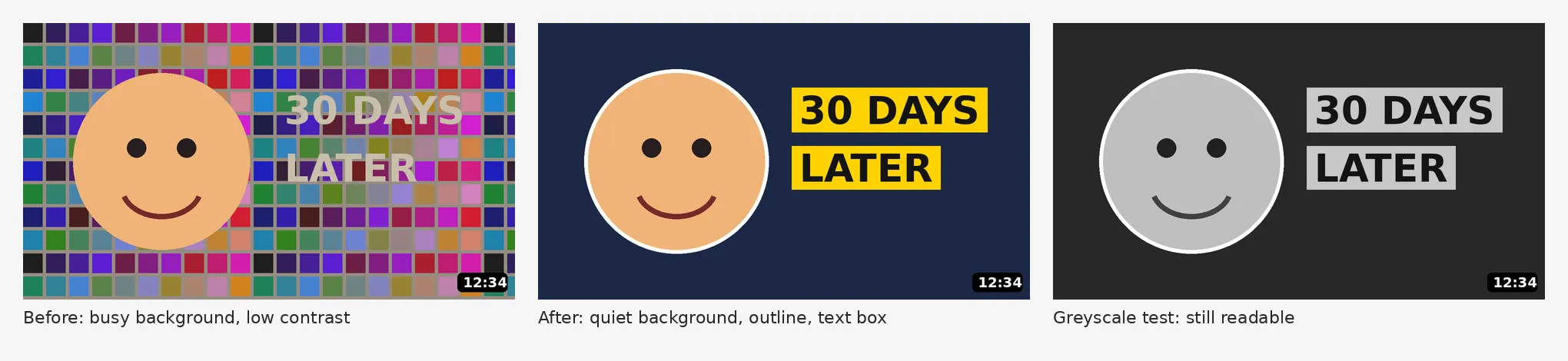
a thumbnail before and after adding contrast, plus the greyscale test
Text size: fewer words, bigger letters
Text on a thumbnail is not a title. The video title already sits right below it. The thumbnail text should add something the title doesn’t: a number, a result, an emotion.
Three to four words at most. “I tried it for 30 days” is a sentence; “30 DAYS LATER” is a thumbnail.
Make letters at least a tenth of the image height. On a 720-pixel-tall canvas that means a cap height of 70–100 pixels. Anything smaller turns into a grey line on a phone.
Choose a heavy, simple typeface. Bold sans-serifs (Montserrat ExtraBold, Bebas Neue, Anton, Inter Black) hold up when shrunk. Thin, decorative or script fonts do not.
Give text its own contrast. Use a solid shape behind the text, a thick outline, or a strong drop shadow. Text placed straight on a photo is often readable on the big canvas and invisible on a phone.
Keep it away from the edges and the time badge. Leave a margin of about 5% on every side.
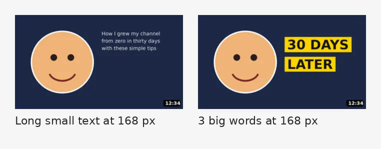
the same thumbnail with 8 words of small text and 3 words of large text, shown at 168 px
Keep a consistent look across your channel
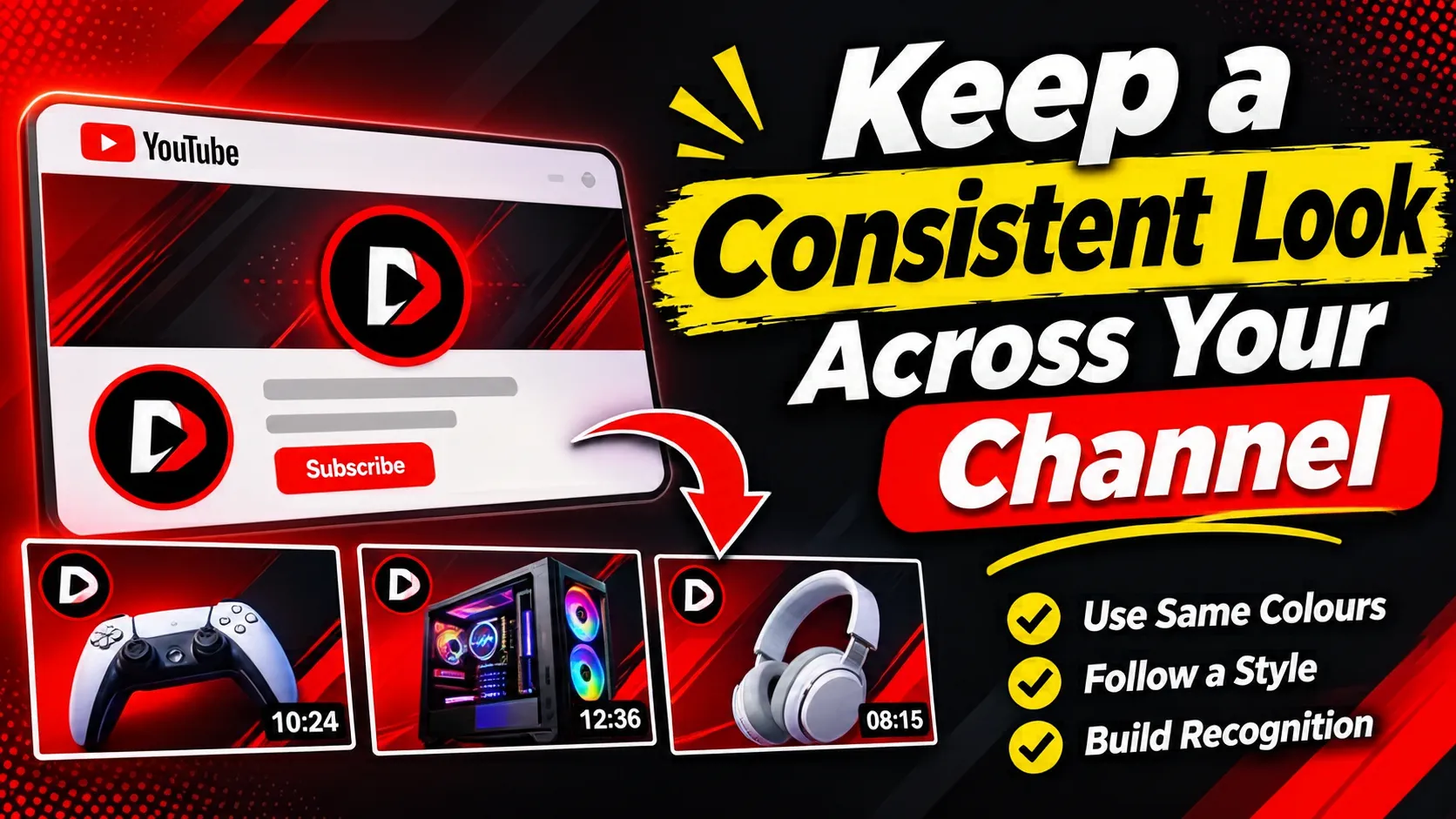
Viewers recognise channels by their thumbnails before they read the name. Pick two or three brand colours, one typeface and a recurring layout (for example, face on the left, text on the right) and stick to them. Consistency makes every new video look familiar to people who have watched you before, and that familiarity is a click in itself.
A 60-second checklist before you upload
- Shrink it to 168 px wide — can you tell what the video is about in one second?
- One focal point, big enough to fill about a third of the frame.
- Nothing important in the bottom-right corner.
- Subject clearly separated from the background — passes the greyscale test.
- Three or four words, letters at least a tenth of the image height.
- Readable in both YouTube light and dark themes.
- Matches the rest of your channel.
Measure, then iterate

Design is half the work; the other half is checking what viewers actually do. YouTube Studio shows the impressions click-through rate for every video. Compare videos with similar topics and change one thing at a time — the background, the text, the crop — so you know what made the difference. YouTube’s built-in “Test & Compare” feature lets you upload up to three thumbnails for the same video and see which one holds viewers better.
A good thumbnail won’t save a weak video, but a weak thumbnail can hide a great one. Spend ten minutes on it — and judge it at 168 pixels, not 1280.