Table of Contents
Rarely will you ever see a photo portfolio that is as beautiful as its content, however no one knows why that is. Designing a photography portfolio is neither a difficult nor time-intensive task, yet the a good photo portfolio is still hard to come by which makes the common photo editor miss the days of the portfolio book. Thus, the key to designing a great photo portfolio comes from the big black portfolio book.
A common mistake that designers make is making the site about the design rather than about the photos themselves. As a result, most of the sites we see are extravagant displays of flash animation that take forever to load. A good photo portfolio doesn’t need a design to set the mood or tone of the page because the photos will do that job for you. The design just needs to sit back and make sure that navigating the photos will be just as easy as turning the pages of a portfolio book. Here are some sites that demonstrate great photo portfolio design.
Kalle Gustafsson
Piraja studios designed Kalle Gustafsson’s portfolio to look and feel like a magazine. The simple arrows and navigation below make this portfolio seamless to navigate.
Jeremy Cowart
Jeremy Cowart is a photographer of immense talent and yet his site is as simple as can be. The photos are navigated just like a blog, as is the menu bar on the right side. The site is made to give the user a familiar feel, as well as provide all the conveniences of social media right where you’d expect them.
Maurice Krijtenberg
Maurice Krijtenberg is not only a skilled photographer but an amazing designer as well. He designed his portfolio to feel as if you were sitting down with the photographer and looking through his photo book with him.
Paolo Bocardi
Fashion photographer Paolo Bocardi proves that all you need is an amazing logo and your photos will do the work for you. The real stunner in his portfolio is that the photos serve as the background for the site, letting the user browse through his work with the scroll of their mouse.
Eric Ryan Anderson
One of my favorite photographers, Eric Ryan Anderson, definitely knows how to utilize the side scroll for his portfolio. Even better, his portfolio also displace his stories in thumbnail format for quick and easy browsing.
Dimitris Theocharis
Dimitris Theocharis’ portfolio takes side scrolling to another level as the site spans the photos across the whole page leaving simple and minimalist buttons on top for navigation.
Rinze Van Brug
Rinze Van Brug’s portfolio emulates a photographer’s light table with wide display of thumbnails. It lets the user magnify the photos they are most interested in.
Stephen Vernon Clark
Liberty Create designed Stephen Vernon’s Clark’s portfolio to feel a little familiar to music lovers. The navigation wheel will instantly remind you of scrolling through your music library on your ipod.
Anton Demin
Anton Demin’s simple portfolio displays his work seamlessly and hassle-free. The simple side navigation is easy enough for anyone to figure out and the site’s minimalism lets the photos take the spotlight.
Mike Stocker
Mike Stocker’s portfolio displays his collection in the thumbnails giving the user the freedom to navigate to their desired photo. However what really sets the mood for this minimalist design is the choice of the large photo as the background for this thumbnail table.
Giles Revell
Giles Revell’s photos flow just as smoothly as the design of his portfolio which both display a bit of minimalism and chaos. The design is impeccable, but you’ll find different navigation around every corner.
Rankin Photography
Rankin has quite a number of photos in his portfolio so he organized it the way a library organizes their thousands of books. He gives you a little preview of each photo and the user clicks on the one that entices them the most.
Girl with a Camera
Girl with a camera displays all her work out for you in the form of blog posts, but the navigation for the site is in the form of pictures as well. Quite clever I might say.
Glitz Photography
Glitz Photography’s colorful portfolio would do their name proud. Neither the site nor the photos resemble anything near boredom.
Aspire Photography Training
Not really a photography portfolio however Aspire Photography Training takes the design of the one-page-website and finds a way to apply it to photos. The result is a magazine-like collage that gives the user a sense of the photography training they have to offer.
Diana Thorneycroft
Diana Thorneycroft odesn’t bother with navigation but gives you a visual preview of all her work in thumbnails. This is a navigation for photos that is definitely visually appealing and lets the photos sell themselves.
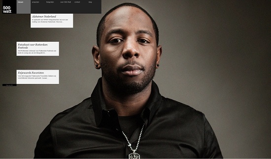
500 Watt
Those who love things organized neatly will love 500 Watt. The portfolio organizes the thumbnails in rows by projects for an easy view of the photographer’s work over time.
Even the simpliest websites serve the purpose of letting the photos shine and that’s really what a portfolio is. A photo portfolio just needs to serve as a beautiful and interactive portfolio book that anyone can flip through.


