Table of Contents
Creating a web page that isn’t user-friendly or easy to update is a complete waste of time.
Why would anyone intentionally build an inferior site when technology enables better design for the same amount of work? What you should do is craft a page that enhances the reader experience while increasing your efficiency. It’s remarkably easy to do. Here are six ways responsive web design transforms the user experience.

Image via Flickr by Janitors
The Interface Works Better
As consumers become more reliant on smart devices for their web browsing, they grow to expect a simpler user interface.Responsive web design responds to this trend by providing a seamless, intuitive relationship between the reader and the page through an interface which automatically adjusts to fit the type of computer display accessing that page. When done well, the navigation for a site is simple enough that a first-time visitor innately understands how to interact with everything on the page. Responsive web design also guarantees that all links, polls, and videos load correctly on any display
The Content Is More Readable
Prior to the introduction of responsive web design, developers offered a one-size-fits-all style. The page visitor would see exactly the same layout regardless of the type of display. That meant some text would seem too small on larger screens and far too large on tiny ones. Programmers had to aim for the middle by writing code for the most popular user displays. Everything else would suffer because the screen resolution was wrong.
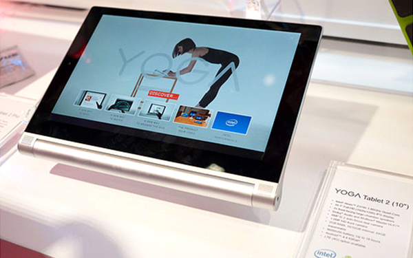
With responsive programming in place, every screen layout will optimize to the appropriate resolution, although they’ll look best on large-screen 2-in-1 laptops such as the Lenovo Yoga series due to the intended marriage of smart device with laptop. This optimization is not only more user-friendly, but also the best way to entice readers to return to the site again and again. Responsive web design is a form of coded positive reinforcement.
Faster Load Time
One of the priorities of mobile readers is response time. People who are not sitting in front of their computer experience urgency with their internet surfing. They might have only a short period of time to access the information they need, so the pages have to load quickly. A page that isn’t optimized loads at the same speed for a tablet as it does for a desktop computer.
Conversely, one that does have responsive web design loads much more quickly. When coded properly, the user interface takes into account the need for timeliness. It works in the background to prepare additional page views linked from the landing page. In the process, not only the first page, but every other page on the site, is more responsive.
Images Load Correctly
Tying into the other issues above, a poorly designed web page won’t display images correctly across platforms. That’s because the code doesn’t consider whether the user interface is capable of loading the graphic. It’s why some pages look blurry while others make a picture look absurdly oversized. Responsive web design again prevents this issue from occurring.
Less Bandwidth
Google recently altered the way that they score web pages. One of the highest priorities now is the load time of the pages. Coinciding with this is the mobile optimization of a page. That’s because the people at Google understand that more people surf the web from mobile than from desktop and laptop computers now.
With so many readers employing smart devices, bandwidth usage is a much greater concern. Whereas home broadband users rarely encounter data overage charges, people using cellular devices are in constant fear of going over their monthly allotment. Responsive web design reduces this worry, because the fast-loading pages employ more white space, thereby reducing bandwidth.
Posts Are More Social
This style of web design includes an added bonus for both the web page owner and the site visitor. Plenty of coding shortcuts exist that enhance the user experience without negatively impacting any of the advantages above. One of the most prevalent is the addition of social media buttons.
When users explore a site, ease of access is the most pressing consideration. Any web page that hosts a series of buttons to share content is superior to those that don’t. Visitors have grown to expect a viral component on web pages, and that’s simple to do thanks to responsive web design.
We can see numerous explanations for the superiority of responsive web design. It’s easy to understand why Google now favors this style of web page over all others.

UI/UX Consultant, Photoshop, XD, SketchApp, Product Designer, Website Designer, Mobile App Designer, Expert WordPress Developer. For web/mobile design and wordpress development related projects please contact me at dibakar@themepurpose.com


