A website that responds to the device that accesses it and delivers the appropriate output for it uses responsive design.
Rather than designing multiple sites for different-sized devices, this approach designs one site but specifies how it should appear on varied devices. These tutorials will help you to get started with media queries in order to create your own responsive or adaptive web designs. The resources in this collection is hand picked and the best in web currently.
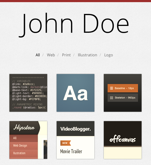
Build a Responsive, Filterable Portfolio, with CSS3 Twists
Techniques For Gracefully Degrading Media Queries

How To Use CSS3 Media Queries To Create a Mobile Version of Your Website
CSS transitions & media queries
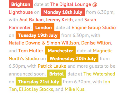
Responsive Web Design
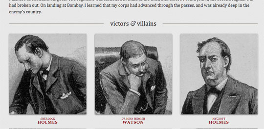
Experimenting With Responsive Web Design
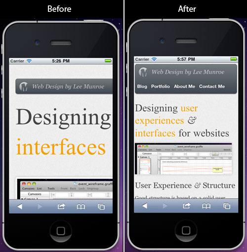
Quick Tip: A Crash-Course in CSS Media Queries
Building a Responsive Layout With Skeleton

CSS3 Media Queries

Understanding the Elements of Responsive Web Design