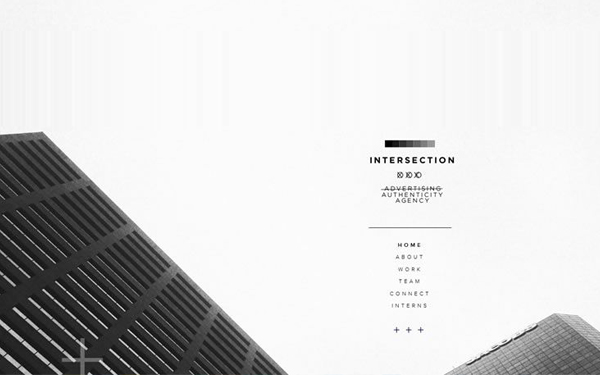
Table of Contents
When you start to design a new website,
be it to optimize your video, or for something else, you need to choose how you’re going to lay it out. Are you going to go with something avant-garde or are you going to go with something tried and true? Both have their advantages and disadvantages.
The avant-garde might draw eyes from far and wide. Or it might fall flat on its face. The tried and true, in the meantime, won’t get as much attention from the designers and the critics, but at least you’ll know that it won’t be ridicule either and that it will stand the test of time.
If that latter category is more your thing, then read on. Here are 5 website layout ideas that never get old.

The Hero image on a simple grid
One big image on top of several smaller ones (with some of those possibly being text boxes) is a great layout, particularly in this age of many different screen sizes and many different devices. By using the hero image with more images below it, there is the potential for the user to scroll through numerous images and text boxes and really digest what you’re trying to say.
Structure:
• Navigation panel
• Hero Image
• Somewhere between 2 to 4 columns of icons and/ or information
• Main body area
• Footer
The reason it’s such a tried and true layout is because there is a logical consistency and flow to the layout that’s naturally pleasing to the eye. The big image effectively draws them in, while the secondary elements entice them to move deeper into your website.
A great more recent modification of this format is instead of only having a static image, using a slider image, which allows you to showcase far more. Obviously, a video image will also work well in this position.

The Defined Grid
The grid will never go out of style. Nor should it. It tells a clear and succinct message on its own, which is ‘I am organized’. You’ll find that many designers actually opt for this kind of a layout for their portfolio, with each of the grid items referring to a portfolio item.
The grid design, when filled in with interesting content and well-considered photos will give your website a great deal of oomph, without making it, due to its easy to understand layout, too crazy and overbearing for the user.
Note that you don’t just have to provide images. Text can also be provided, though in this case you might want to have differently colored boxes so that the overall structure isn’t lost (And people don’t end up reading from one box into the next, leaving them utterly confused).

The F Pattern
As well all know, people scan text-based pages in an F pattern. They start at the top, scan along the menu bar, and then come down the left-hand side, occasionally reading some of the headlines that you’ve provided.
So why shouldn’t we accommodate that by laying out the page in that style as well? In this way, we give the user exactly what they want, ease their use and increase their User Experience, without them even being fully aware that you’re playing to their wants and desires.
What’s more, it will make certain that the information you really want them to see, be it a headline or a Call to Action, will be seen by them. And that ultimately has to be what you’re trying to achieve, doesn’t it?
Structure:
• Header and navigation
• Wide left hand column with main content
• Menu and links on the right hand side
• Footer
For an interesting variation, instead of using a header, use a hero image, so that you can draw your users in with something tantalizing and fascinating.

Single column
When you have a simple thing that you’re trying to tell, you can certainly do worse than the one column layout. The great thing about this layout is that it is restful to the eye, with their being large amounts of negative space. This means that the user knows exactly where they’re supposed to be looking, which makes sure that they don’t lose sight of the forest through the trees and don’t miss what you’re trying to say.
This works very well for when you don’t actually have that much to say, but want people to pay particular attention to what is being said. This might work well for a CV or a portfolio, for example.
Structure:
• Navigation
• Everything else
• Footer
Do make sure that the elements that you put on your page are far enough apart. Otherwise, there’s a risk that because of the negative space on either side, the actual layout will appear cramped. Also, consider using Parallax design to give your page a bit more depth and character.

Minimal
Minimal is awesome. It means that the user has a relaxed and easy experience, where they don’t lose sight of what you’re trying to say and don’t miss any of the important elements.
Done correctly, it can really let you emphasize important elements of what you’re trying to say, by – for example – displaying a product and little else. By making sure the user does not get distracted by other elements, they can really appreciate what you’re trying to do. That’s why it’s an effective layout of you want to showcase subtle but attractive design.
What is more, minimalism is timeless and associated in the minds of most people with stylish. After all, Apple is all about minimal. And as long as they remain the undisputed masters of the tech world, you could certain do worse than following in their footsteps.
Last words
These designs wouldn’t be timeless if they weren’t effective and attractive. They are clean, easy to read and immediately understandable to users. And, as we like what we know, that makes them effective layouts for any website.
What’s more, because they’ve worked so well in the past, you can be certain that if you choose one of these layouts you’ll have a design that will stand the test of time with only minimal tweaks and changes. That can be incredibly effective if you want to build it and leave it as is for the foreseeable future.
Yes, Avant-garde has its place, but so do these designs. And at least here you know that if it doesn’t work, it’s not the fault of the design, but it’s all down to you.


