Table of Contents
With new inventions being launched every now and then, the tech world keeps on evolving at a rapid pace.
While the tech world continues to grow, many design and development challenges are presented by – increasing number of sophisticated browsers, growing usage of mobile devices and much more. Through this post, I’ll explore some of the new web design and development trends – that will influence the future of the web industry.
The Line Between Websites and Apps is Blurring

Long gone are the days, when we only had access to a handful of apps, and majority of the small business owners didn’t even prioritize having an app. But, today apps are everywhere and have become an integral part of our life. And, at the same time the need for having a responsive website has also gained traction – that helps in building websites that look and function just like native apps – but make the content accessible across all the devices.
For now, users often require to use a native app since they want to access hardware capabilities such as Camera, Geolocation, etc. But, with improvements being made in the browser technology, such capabilities can also be accessed within a web page as well. The result: It won’t be too long when device capabilities will get integrated into all mobile browsers, allowing developers to make use of hardware features within a typical website.
In a nutshell, soon you won’t find any difference in an app and a site. The Next Web website is an excellent example of how a website looks just like an app.
Mobile-First & Responsive Design: Will Become a “Requirement” Than a Buzzword

Last year, we observed how mobile usage exceeded desktop usage. But, it seems like people still hasn’t embraced the mobile phenomenon. In fact, many business organizations and website owners alike still focus on making their site look good on the desktop first, and then on mobile. However, in 2015, mobile has become the main device used by the general public to access the Internet. According to comScore, users around the globe are using mobile devices a lot more than desktop systems. most dominant source for browsing the Internet. This clearly suggest that designing a mobile-friendly website first, will become an absolute necessity than just any buzzword circling the web. After creating a design for mobile first and the desktop PC second, you should pay focus on creating a responsive web design (a.ka. RWD). Doing so, will help you come up with a site that can be easily accessed and viewed across different device screen sizes and resolutions.
Basically, you need to pay heed to creating web designs that address mobile users’ needs in the most efficient manner possible. And so, you’ll first need to analyze your audience wants and needs, before presenting them with a web design – that is either designed using the “mobile-first” approach or “RWD” approach.
Flat Design Will Gain More Prominence

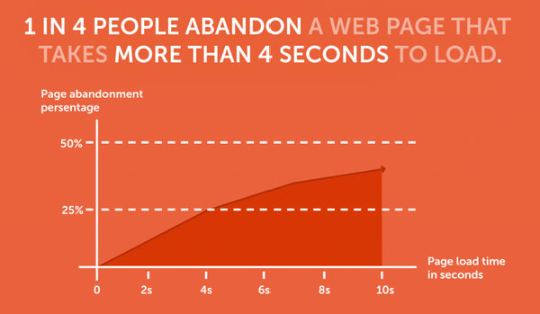
We’ve to deal with not-so-patient users today, who want instant access to information. And thus, making such users wait for even a few seconds can make them annoyed. This means that to increase the attention span of the modern online surfers, it’s important that your website loads quickly. According to an online survey, “1 out of 4 people abandon a site that loads in more then 4 seconds”. The above stats indicates that it is very important for your site to load faster, or you could lose a lot of potential customers. There are several ways that can help in making a website speed fast, however, the most easiest and efficient method requires creating a simple website. That’s because, a simple design usually contains only relevant and the most important information, making it load efficiently as opposed to the design having numerous graphics and plenty of data.
Simply put, users have become less patient, and thus presenting them with a design filled with clutter will only slow them down.
This has led to the dwindling use of skeuomorphic design – a design concept that involves creating illustrations that resembles to their real-world counterparts. But, the illustrations cause a site to load slowly. This led to the emergence of flat design – that focus more on achieving simplicity and minimalism. You can expect this trend to gain even more prominence in the coming years.
More Focus Will Be on Touch Gestures

Almost every person owns a Smartphone and prefer touchscreen experience. In fact, we’ve already become accustomed to using touchscreen devices than scrolling web pages. And so, to meet the Smartphone and other mobile device users’ needs, it’s important web designers and developers need to explore ways that enables them to create highly innovative interfaces – that provides an enhanced user experience. This is where gesture-driven interface comes in handy. Such interfaces allow to carry out touchscreen interaction in a highly efficient manner.
The increase in the use of mobile devices has made it more important for developers than ever, to design physical interface that makes it easier for users to interact with an application. And, adding touch gestures helps achieve this objective in the best manner possible.
Let’s Wrap Up!
Every year, we come to know about lots of web and development trends. In 2015 also, we can see people talking about many different trends. But, keep in mind that designing and developing web solutions shouldn’t be something that an individual thinks or believes. Instead, you should design keeping your audiences’ needs in your mind. This will help you in offering your audience gets the desired solution – which they want from you.
In this post, I have attempted to cover some emerging web design and web development trends that every person tied to the web industry must know about. Hope that using the aforementioned key points can help you create a web design that supports the needs of your target audience.


