Throughout their existence Adaptive and Responsive Web designing approaches were confronting one another.
Some consider them to be synonymy; others think that these are different concepts. But as always, the truth is somewhere in between. Originally, both notions provoked misunderstandings especially in what they denote. Adaptive web design is much broader that the Responsive one.
When speaking of the Responsive design we mean only the page layout (“rubber” layout, flexible media queries and images). As for Adaptive design, it is something more than a “rubber” layout. In practice, this is almost the same as the progressive enhancement, in a nutshell, this concept means that we strive to provide the best opportunities for the widest possible audience. Also, we must not confuse the concept of “adaptive web design” and “adaptive layout”, as these are completely different things.
Here you go
And, finally, “An adaptive model” (each screen size has it’s own styles, which are the hard-coded and fixed-size elements) refers to the layout, made by combining a set of fixed horizontal sizes (width). If done correctly the fixed-width blocks are combined with the “rubber” blocks, the adaptive model can be considered a form of responsive web design, and not just an alternative.
In plain language: responsive web design = “rubber” layout, the adaptive web design = “rubber” layout + progressive enhancement.
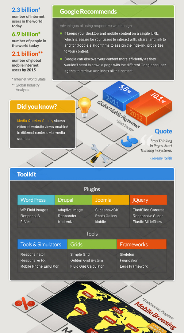
To keep everything clear you can check the following Responsive Web Design Interactive Infographic. Guys who created this piece of work did a great job. They’ve included all necessary notions to get thorough the responsive design, all types of grids, manuals on how to create a responsive website, numerous articles on how to get things clear and what’s more important they hand-picked a toolkit that is perfect for beginners. Click on the screen shot to see the Full-size Animated Version.


