Your website is how your customers get to know you,
so it’s important to make a great first impression. If your website is well designed, it will catch a customer’s eye without distracting his attention from the reason he’s there in the first place (to buy your product, read your blog, etc.)Good typography is an important element in the overall design of your website.
What is typography? To some it’s a process, for others an art, typography is all about making your printed material look good. Here are some principles to guide you in your typographical journey.
- The number one most important thing that you need to keep in mind is to keep it readable!!!It’s easy to get carried away with all of the amazing fonts out there, and serious typographers will also play with the spacing between the letters. But it’s important to remember the reason you’re printing something in the first place: so that people will read it.
- That being said, there are some beautiful, creative fonts out there and you can use them, as long as you do so sparingly. Not Derby Pie shows a great example of using a lovely cursive font, but in moderation.
- Size does matter when it comes to the content on your website.It’s the most direct way to convey the difference between topics, subtopics, etc. Check out the GOOD website which is a great embodiment of this principle.
- Mix your fonts wisely.While you’ll certainly have several fonts on your website, you don’t want to go overboard. At the very least, don’t switch it up within the same paragraph.
- Don’t forget to leave white space! Nobody likes being overwhelmed with too much information all at once.Keep your website clean and with plenty of white space.Break up content by creating more pages if you need to. The website below does a great job of utilizing white space.

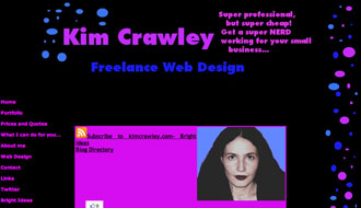
- Pick good colors that not only contrast well with their background (white on black, black on white), but that have the same attitude of the website.Red wouldn’t work on a spa website, but it would be great for a gym. The website below contrasts colors, but chooses a contrast vivid and powerful enough to give the reader a headache—a huge subconscious turnoff.

- Get yourself well aligned!Web content looks best when it’s aligned to the left because it keeps the spacing between letters and words natural.Justified type creates unnaturally large spaces between words that don’t look good.
- Usually, bigger is better when it comes to font size.This doesn’t mean you should use huge letters for no reason, it means that when in doubt about the size of your font, round up, not down.
- Don’t be afraid to use a classic font like Arial or Helvetica. These fonts are widely used because they’re good, and there’s nothing wrong with sticking to what works in this department. Check out the New York Times website and ask yourself how many of those fonts you’ve seen before. Then ask yourself if that matters.(It uses Georgia, Arial, and Helvetica.)
As important as these typography lessons are for website creators, don’t forget that no matter how beautiful the typography on your website, your content is what really counts. So spend your time on that first!


